How to Make a Blender Product Page that Sells

Many Blender Market creators treat their product page as an afterthought. But a poorly designed product page can cost you hundreds (if not thousands!) of dollars in lost sales.
Fortunately, crafting a powerful product page isn't rocket science. You've worked hard on your product, now let's take a look at how to make your product page work hard for you.

Choose a Name that Describes your Product
Don't leave your users guessing what a cryptic product title means. Each product should have a clear purpose and its title should reflect it. A rule to live by: be clear, not clever.
Take these examples of some of Blender Market's bestselling products:
- MESHmachine is a Blender mesh modeling addon.
- Retopoflow is a retopology suite.
- Realistic Nature Asset Pack is - you guessed it - a pack of realistic nature assets.
As a bonus, a descriptive name makes your product easily searchable.
Keep it Simple, Stupid
The KISS principle (keep it simple, stupid) is great for the design phase of your Blender product - and you should apply it when naming your product, too.
Keep your product titles at 2-3 words. Short product names are great for searches, sharing and social media posts.
For example, let's look at Autounwrap, a fictional UV unwrapping addon. Here are two ways of naming it:

Are the extra words in the second title conveying any new information? Nope! Chances are, viewers will just glance over them and they make your product name feel cluttered.
Create Product Images That Sell
I've written about how to create powerful product images before and I'll do it again because their importance cannot be overstated.
Say it with me: I will make custom renders for all my images!
They should be 2:1 ratio renders (not just viewport screenshots). If you skimp on this step, it will affect your sales negatively.
After you've rendered your new images, spend some time on a branding strategy. This could be as simple as adding your logo, name or a certain style or look to make them recognizable and set yourself apart.
Here are some fantastic examples of powerful product images with great branding.
Finally, do not use GIFs for your featured image. Why? First, our system is not optimized for animated GIFs, yet. Second, our social media scheduling software will not pull GIFs from your products, so your featured GIF will not be shared on our social media account.
The "Elevator Pitch" Paragraph
An elevator pitch, is a short description of an idea, product, company, or oneself that explains the concept in a way such that any listener can understand it in a short period of time. (Wikipedia)
The first thing potential customers read about your product should be a persuasive, succinct description. Most customers will not scroll through your entire product page, so give them all they need to know right there in the first paragraph.
By-Gen does this really well: "BY-GEN is a free and open-source add-on designed to simplify the process of creating non-destructive, generative modeling styles in Blender 2.8."
You've drawn a potential customer to your product page with a clear product title and an awesome featured image. Now turn them into a paying customer with a great elevator pitch in the first paragraph of your product page.
List all the Features Benefits, Think of your Users
Now is a great time to list all the benefits of your product. The key to success? Don't talk about features.
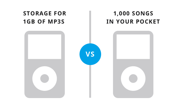
Features describe your product, while benefits describe how the product will improve your customers' life.
One of the most iconic examples of features vs benefit by Apple:
 Image via Help Scout
Still not sure what the difference is? This article takes a deep dive into the essential features vs benefits distinction.
An easy-to-scan list of benefits is great for your potential customers. Also, don't be shy when making your feature list, list as many benefits and plain cool features that might interest a potential buyer.
Here's an example of MESHmachine's great lists. Notice that even though they call them "Features", most items on the list are actually benefits.

Focus on One or Two Main Benefits
Pick two or three of the main benefits of your product and zero in on them in the body of your Product Description.
Add additional images or GIFs to this section, showing what makes them so important to a potential customer.

Community Testimonials
Also known as social proof, consider reaching out to Blender influencers in the community and ask them if they'd be willing to review your product, providing you with a testimonial to use on your product page.
Here's an example of some testimonials from the Flip Fluids product page.

Your product page is the best way to convert curious viewers into paying customers, give it the time and attention it deserves. It is never too late to make improvements, so go back to your existing products and compare them to the suggestions above.
Is the title clear and concise?
Can the message be simplified to reduce confusion?
Do the product images showcase your product well while keeping a consistent format (including aspect ratio).
What impression does your elevator pitch make?
And finally, are you focusing on the right benefits that matter to potential customers?


