Creating Good Featured Images
-
 Written by Matthew Muldoon

Don’t judge a book by its cover. Looks can be deceiving. All that glitters isn’t gold. Heard these sayings before? We all have, yet, as a body of research shows, we continue to rely on appearances when making everyday choices including purchasing decisions. This is why professional-looking featured images are essential when it comes to successful selling.
In a now-famous 2001 experiment, 57 wine tasters were invited to rate two red wines, one presented as a prestigious brand with an intricate label, the other as a simple table wine. The results were clear: nearly all tasters rated the first wine higher than the second. Little did they know, they were tasting the exact same wine. The only thing that differed was the packaging. Even if you’re not a wine lover, the message is clear; how you present your product affects your customer more than you or they might realize. Today, I will discuss specific techniques and resources for using this knowledge to your advantage and creating featured images that do your product justice and inspire your viewers to click “buy”.
Composition
In it's simplest form, composition means having a distinct focal point in an image. The goal is to manipulate a viewer and attract their eye to the desired area. When it comes to product images, this is pretty easy as they tend to showcase one object only. A prime example is the featured images of LKrajewski, showcasing his products on a plain white infinity background. This minimalistic composition ensures that the focal point is always on the product he is featuring. Does this mean that all your images should be done in a studio setup? Not necessarily; sometimes, the product may call for a more elaborate background or added context to show the viewer what it can be used for. However, you should always make sure that your featured image clearly shows what you are selling and minimize distraction by making your product its main focal point.
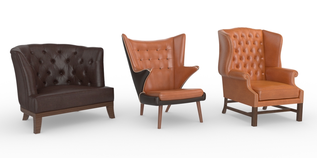 The clean, minimalistic presentation using white infinity background ensures the products of LKrajewski take center stage in his featured images. For more information on composition, Andrew Price has a fantastic video about Understanding Composition, check it out.
Lighting
Getting the lighting of a product right is essential. Even a fantastic looking product can be put down by being over or under lit. Is lighting not your strong suit? If that is the case, I strongly suggest checking out Kilvio's Studio Scene Kit Pro or Studio Scene Kit Lite, two amazing products that make lighting your models a no brainer. No matter what type of lighting setup you use, the obvious key consideration is making sure your product is well lit and that the lighting is interesting. Let’s take a look at an example; the drum set below isn't just lit using an HDRI image or a couple of white lights. It features nice reflections, white lights, and a warm and cool color light. The resulting effect is a realistic, intriguing image that looks alive and appeals to the viewer’s emotions much more than plain white lighting would achieve. While this might not be appropriate for a different product like a natural object or an architectural element, it is perfectly complementary to this subject. Simply put: the drum set looks ready to rock!
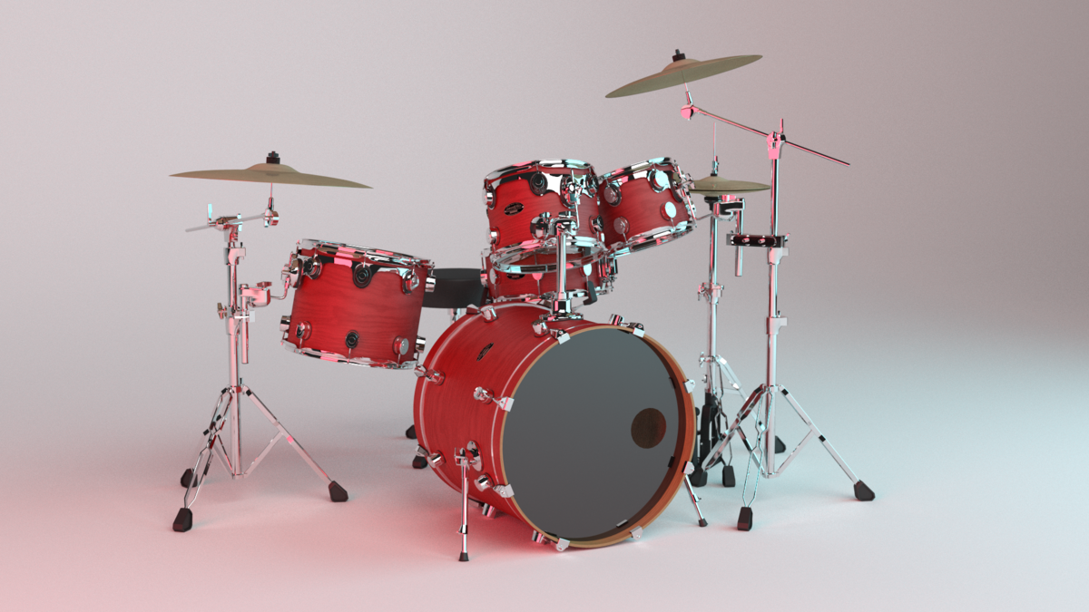
The image is lit in a way that enhances the dynamic and emotionally charged nature of the object.
Branding
Now that you have perfected your composition and lighting, it is time to implement branding into your featured image. Remember our wine tasting experiment? The label and bottle alone made the participants make up their mind about how much they liked the wine - probably before they even tasted it! Similarly, your product preview images determine your viewers’ first impression and present your advertising campaign, packaging and branding, all in a 400 x 225 px area. When doing this you want to keep in mind the Principles of Design. In my blog post on Become a Better Creator, I touch on the subject of branding your product, which can be a simple element like a logo or a graphic, as well as a complex set of factors that determine your overall look or style. A great example of using a distinct look as a way of branding is Jim Morren's products. Whether Jim is selling shaders, models or node setups, I can always tell they are his products because of the consistent branding style.
 Giving your featured images a consistent, distinct look like Jim Morren’s increases their recognizability and helps build your brand.
Color
Because of its strong subliminal messages and ability to move us emotionally, color plays a key part in setting a tone for your brand and images. Take a look at Entrepreneur's great article and infographics about the role that color plays in marketing. Give it a read to find out how to use colors to your advantage.
Framing
An important aspect that often gets overlooked is framing your product's images to fit the website's frame. Regardless of whether you have a vertical or horizontal product, keep in mind that it is going to be displayed in a 2:1 frame ratio on the website.  The featured image used on the main slider on the homepage is 1200 x 600 while images used on individual product pages are 890 x 445, both in a 2:1 aspect ratio. Last but not least, be careful where you place text or logos. When a product is featured it is added to the main slider on the front page of the site. The site then adds pricing and title information to the bottom third of your featured image, which means that any text or logos you may have in that area will be covered up.
Creating powerful product images takes more than just hitting render; it takes thought and effort to ensure you are getting the most out of them. Today, we looked at composition, lighting, branding, color, and framing as key elements to keep in mind. To find out more about how to achieve professional-looking product images take a look at Improving Blender Renders with Photography Techniques. While the tutorial isn't explicitly geared towards product images, most of the same principles apply. How do you create your product images? Do you use any of the techniques mentioned here? Let us know in the comments.