3D Data Visualizer


Version 3.0 is now released. We have added 1) Wine glass animation style, 2) Complete re-design of the add-on menu options, 3) Several enhancements like auto text wrap for long text, adjustable width, animated flag & flag poles, additional fields for secondary data etc.
Important Note 1: We have refreshed our menu options. So if you already have one of our other products installed, the menu option may not work as expected. We have updated all our add-ons on this site along with this add-on. Please remove everything and install them again. Only then the products will be in-sync with each other. You don't need to worry about this if this is your first purchase from our store.
Important Note 2: Earlier we had one single template for all data comparison videos. But with a growing animation styles that we are offering today, we found it's easier to keep these animation styles separate. So now we have a separate template for each animation style, the old template won't work anymore. Please use the correct template for the animation style you need - all templates are included in the download package.
This Blender add-on can read your data from an Excel file (or CSV file) and create some awesome 3D graphs or data comparison videos for you. It also takes care of the camera movement and the lights, so you can immediately render the scene and get the final output within minutes. Or you can customize it further if you wish, like you can add your own background, add your own materials, add overlays etc.
This add-on works both for Eevee and Cycles with similar outputs. It will also add waving flags into your composition if you select this option under Data Comparison. The add-on operates in 3 different modes as described below and they come with separate menu options:
1. Animated Line Graph
You need to select an excel file or a csv file that contains your data. Optionally, you can choose the colors and set other parameters from the operator box or go with the default values as shown below. Once the composition is created, you can hit the render button!

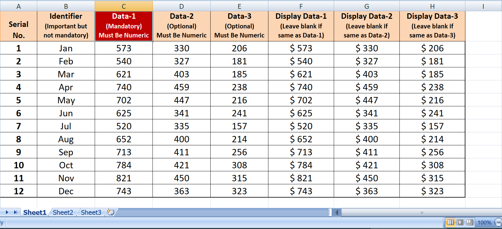
The data should be in a specific format or template. This template is available in the downloaded package, and you can also open it from the operator box itself.

The excel file can contain one single series of data or two series or three series. If you enter only one series of data, only one graph will be created. With two series, it will create two graphs together like below. It is always good to turn on the Normalize option for a perfect output (please check the user guide to know more about this Normalize option and the Logarithmic Scale option).

2. Animated Bar Graph
You can create a bar graph as well. The operator box has similar options here like the line graph, e.g. the bar colors, animation speed, size of the text fields etc. You need to select an excel file or a csv file like before and it has similar options like Normalize, Logarithmic Scale etc (refer to the user guide for more details).

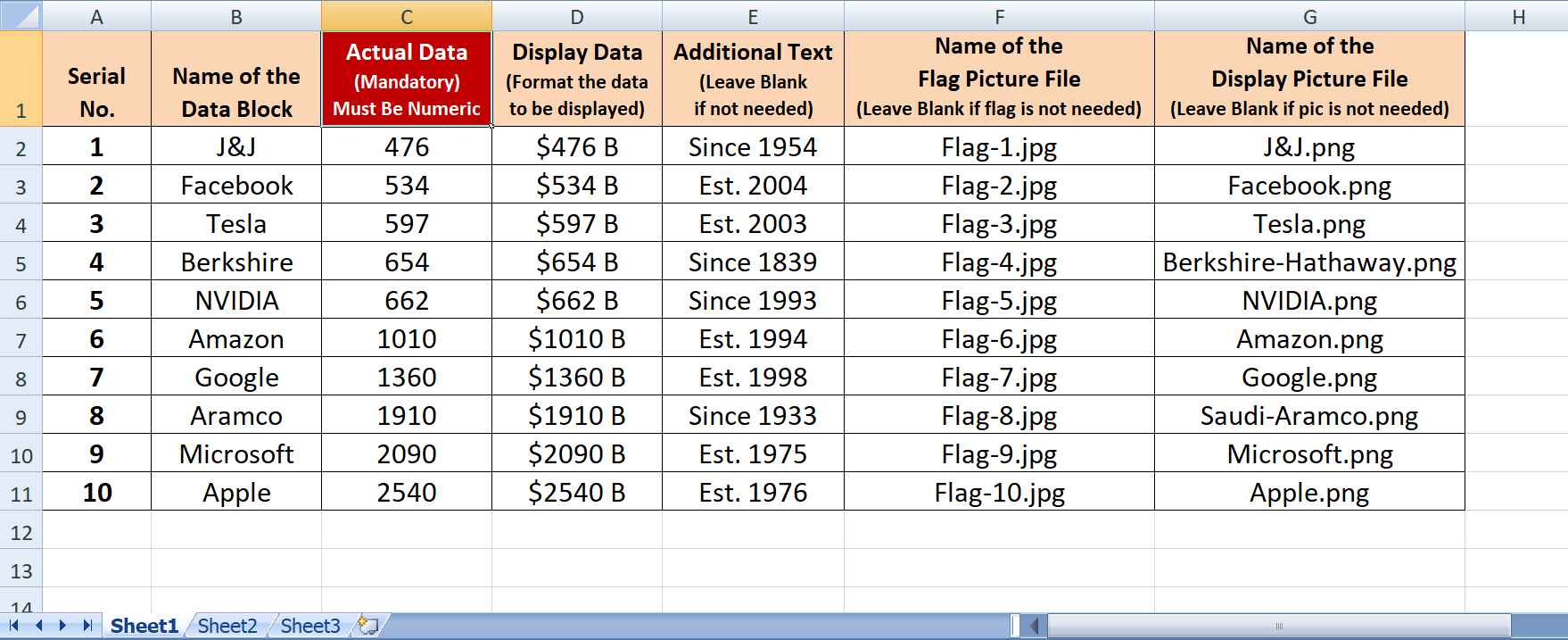
In the excel template, you need to provide a primary column of data, a secondary column (this is optional) and a tertiary column (this is also optional).
Below we have one example where we have used 3 columns of data to produce this output. You can use one single column as well, for a simple bar graph.

3. Data Comparison Video
In this mode, you can create some 3D data comparison videos that are quite popular these days on YouTube. You can also use these videos in office presentations, project life cycle displays, product demonstrations and in many other places. By applying various animation styles, you can come up with awesome, intriguing and unique animations for your specific requirements.
There are two options here: Eevee and Cycles, under each animation style. You can use the option best suitable for your project/ your machine configuration. Cycles would provide you slightly better result, but it will also take much longer to render. If your machine is slow, you can even render your scene faster in Cylces on Google colab, check this tutorial for the same: https://youtu.be/xYqOjIo_4tA

The operator box has various options to fine-tune the animation up to your project requirement and your artistic preference. You can choose from many different animation style options and the floor options. Further, you can customize some additional options like the data bar width, data height range, or national flags waving in the air. If you are interested, check-out our add-ons called City Line Generator & Auto Flag Generator which can be used along with your 3D Data animations (Auto Flag is now integrated with this add-on from version 3.0 onward, so no need to purchase that add-on separately).
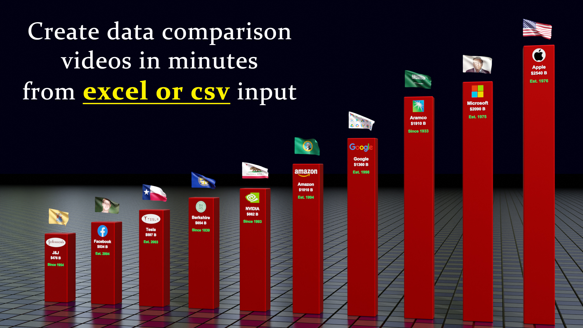


The data for this operation has to be in an excel or csv file like the above. Each animation style now has a different template that you must follow. You can get these templates in the downloaded package.
Once you install this add-on, you'll get 3 menu options for the 3 modes of operation. The 3rd mode i.e. Data Comparison comes with two options: Eevee and Cycles. They will produce slightly different results suitable for the respective render engines.
When you purchase this product, you'll get 1) one installation package (zip file) to install 3D Data Visualizer add-on, 2) one pdf handbook that contains the installation guide and a step by step document on how to use this add-on, 3) one zip file that contains all the templates - you need to prepare your data in excel following these templates.
Important Note 1: This add-on needs pandas and openpyxl in your system (both are available for free) if you want to use excel files. If they are not already installed, you can install them from the add-on preferences. In the installation document, it is described along with detailed screenshots on how to install these dependencies with a few clicks. Please follow that for successful installation.
Important Note 2: If you are unable to install them for some reason, you can still use this add-on. Save your excel file as a csv file (Go to Save As... and choose the csv option with comma delimiter). Now use this csv file in our add-on and it will give you the same result. 3D Data Visualizer works with both an excel file or a csv file alike.
Please read the documentation included in the download package for an easy guide on how to use this add-on. For any assistance, or any bug reporting, please feel free to send a mail to [email protected] or connect to us via our YouTube channel. We are always there to help you!
Change log: Version 3.0 Changes include 1) Wine glass animation style, 2) Complete re-design of the add-on menu options, 3) Several enhancements like auto text wrap for long text, adjustable width, animated flag & flag poles, additional fields for secondary data etc.
Change log: Version 2.2 Changes include some defect fixes and enhancements for the new Blender version.
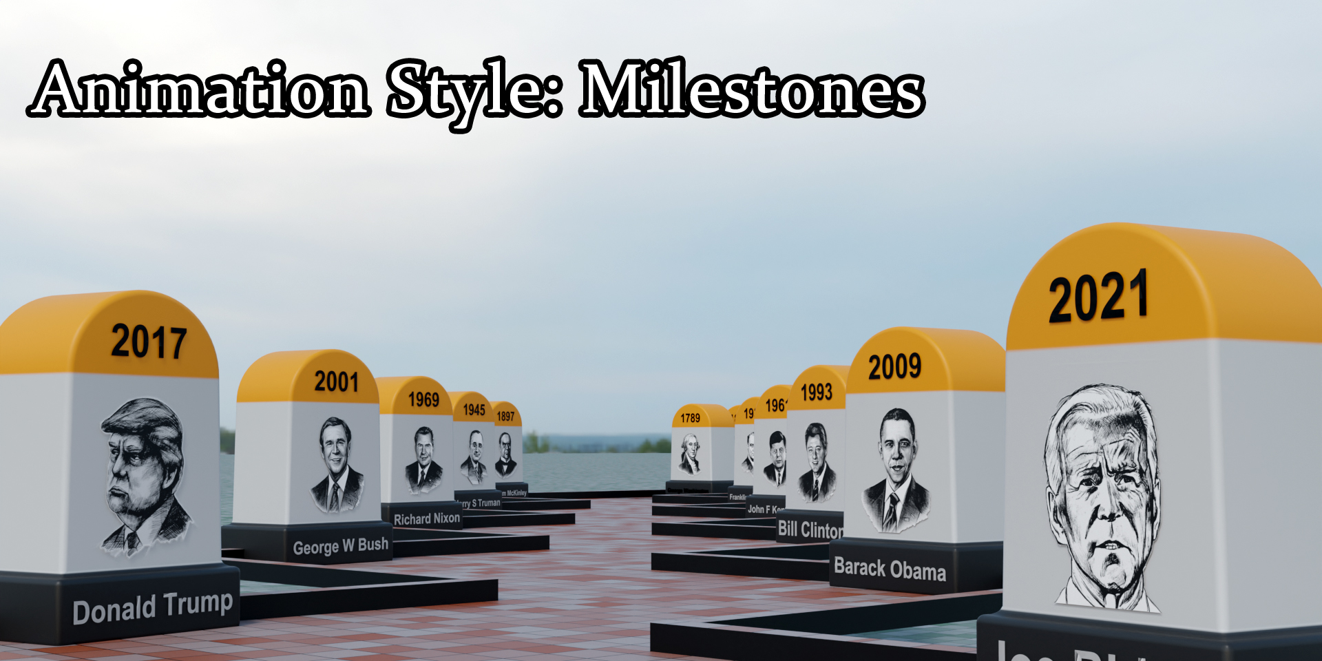
Change log: Version 2.1 One new animation style is added that shows milestones along a zigzag road.
Change log: Version 2.0 Changes include: 1) Some new animation styles, 2) Multiple floor types are added, 3) A new field is added (Additional Stop) to better control the camera speed, 4) Some minor enhancements.
Change log: Version 1.2 Changes
include:
1) Auto adjustment for long text fields, 2) Now you can enter 3 series
of data for the Line graph just like the Bar graph, 3) Some defect fixes
& enhancements for the flags.
Version 1.0 This is the first version we published!
| Sales | 100+ |
| Dev Fund Contributor | |
| Published | 9 months ago |
| Blender Version | 4.1, 4.0, 3.6, 3.5, 3.4 |
| License | GPL |
Have questions before purchasing?
Contact the Creator with your questions right now.
Login to Message